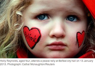
This image taken from The Guardian website shows a young girl who was part of the recent peace gathering at Belfast City Hall. The image on her cheeks derives from the identity I was involved in designing as part of Belfast’s brand programme. The heart-shaped B formed a central feature in the brand, which aimed to help people see the city in a new light. The brand programme was announced on 8 May 2007, the day that ‘power-sharing’ between the main political parties in Northern Ireland was instituted. In the course of the work we talked to people from all sides. We recognised that Belfast was at a pivotal moment in its history; it had the opportunity to look forward without denying its past, and to built on the positive changes that were taking place. The new brand was launched a year later on 1 July 2009. What was clear then, and is clear now is that symbolism, whether it be the union flag, or the images on the walls of the buildings, is a potent element in the creation of identity. Perhaps in time the Belfast brand can become a symbol of peace and hope for a positive future for Belfast.
The full story of the programme was published in Place Branding and Public Diplomacy Vol. 6, 2, 104-111.